In the second in our series of interviews with industry leaders we talk with Helen Berresford, Head of ID:SR – the award-winning interior design group at architects Sheppard Robson. We explore the design philosophy that helped make the Duet development in Manchester the highest-rated building on HomeViews, and the benefits of having in-house architecture and interiors teams. We also discuss the pandemic, wellness and the convergence of home and office.
HomeViews: Helen, congratulations on Duet currently being our number one rated building in the UK (as of June 2020). Reading the reviews for Duet and other buildings you’ve worked on, it’s a great accolade for you guys to have the number one building and a massive pat on the back for your team.
HB:
That’s brilliant. We’re very, very proud of that. I always feel like it’s those real user scores that are the most important of all.
HomeViews: It’s always been difficult, particularly when a building’s been lived in for a few years, to get that feedback from residents on how a building evolves and what does or doesn’t work. How have you integrated that into your process?
HB:
It’s so, so valuable what you do at HomeViews because you’re collecting post-occupancy information in a way that all designers should take note of; empirical knowledge that comes from a chorus of voices rather than just the consultant team.
It’s all about a people-centric understanding. Even if it’s the little details, actually little things are very important to people.
The use case
HB:
The use case is fundamental. Understanding operations and facilities management is often seen as the less sexy side of the design process. But those are the drivers for activity within that space. Therefore, if you understand them, you can then do the lovely, wonderful things in terms of placemaking – once you know what that use case is.
For example, we’ve worked with Get Living for a couple of years now. We started looking at the very first refurbishments of the Stratford Olympic Village development and usage.
Those apartments had been used for a number of years. We were able to work with their detailed knowledge of all those lists of issues and concerns from an operational point of view. That really helped us to understand what the key drivers are and the little details that are so important.
Desirable details
Hospitality isn’t always a grand gesture. If you go into a brilliant hotel, every detail is cared about, whether it’s the tuck of the bed linen, the fluffiness of the pillows, the taste of the coffee… that service is all about the details.
I think having worked on a number of typologies helps us. For example, hotels and offices are becoming increasingly hospitality-orientated.
We’ve designed offices that have Michelin Star restaurants in them. The Ace Hotel in Shoreditch is somewhere people go just to hang out, and the entrance foyer at the Citizen M hotel project we worked on is always packed out.
Residential projects are now much more connected to the success of rental. You have to make them desirable or they don’t wash. They need the hospitality offer and I think that’s where our USP lies – in assisting and understanding the importance of detail in those areas.
6* service
If you look at how organisations like Get Living have developed, they’ve turned operations and neighbourhood creation into an art form and a brand.
Footfall speaks louder than anything. For Get Living, it’s a business plan: if people don’t like it, they move on. That put our designs in the context of a really important facilities management model.
They’re defined by their yoga and painting classes and the people who think it’s cool to just hang out at their buildings. Thanks to BTR, more people are choosing their homes based on finding the right neighbourhood and being with interesting people doing interesting things.
Six star service is actually about better service and a discreet environment. We’re extremely aware that people renting a space want to feel like it’s their home too – the challenge is how to personalise that space.
Duet, Manchester
HomeViews: The Duet development by Moorfield is our highest-rated development and obviously a highly successful building. What would you say is the recipe for that kind of success?
HB:
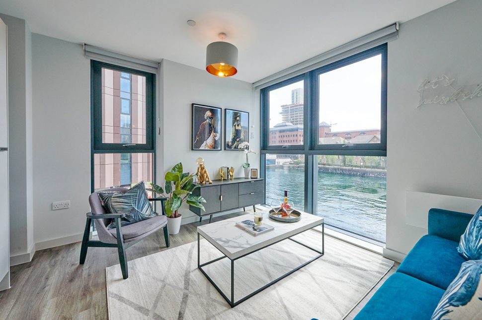
Firstly it’s about the scale of the spaces. Any good environment is like a mini city in itself.
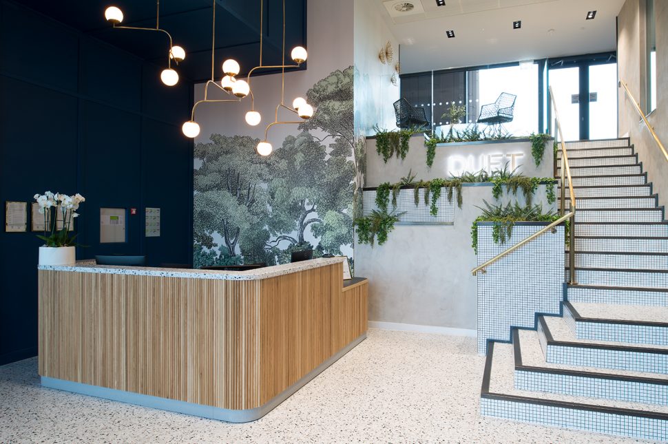
So the architecture for Duet is strong and iconic as you walk into the entrance. There is a sense of character – a brave thing to design because five or ten years ago blandness would be the safe option. Now the arrival experience has a strong character that connects to its locality.
But there was also a strong rationale to that design theme, too. The design feels authentically developed. You feel that you’re learning something, enjoying something. You’re experiencing something when you’re there.
The design journey
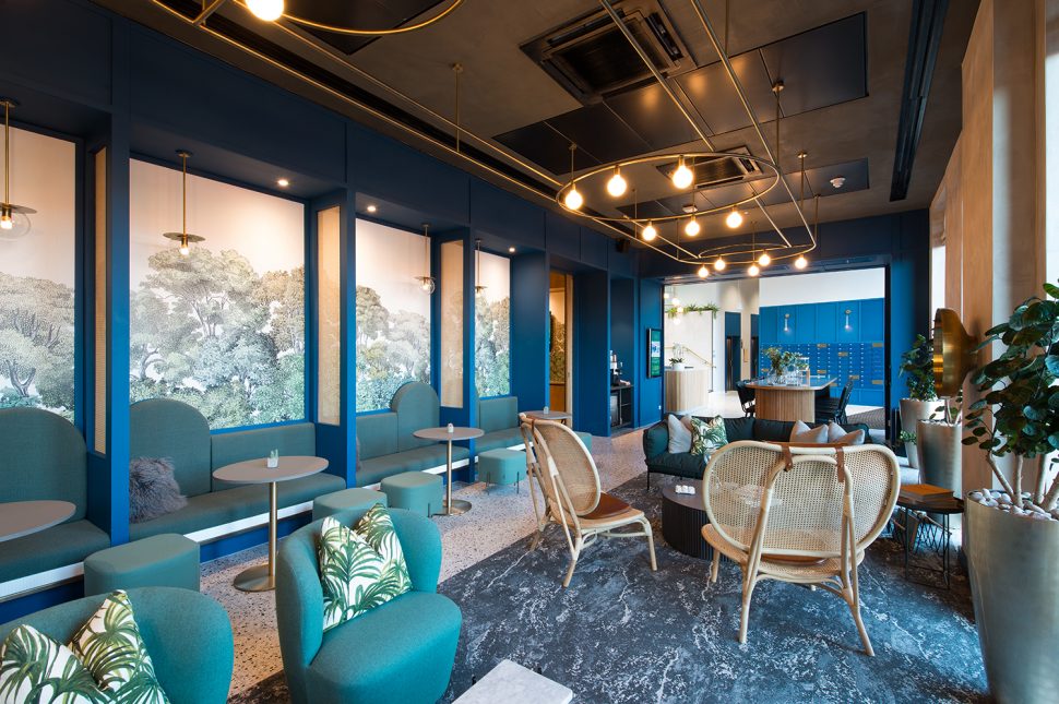
Every detail is thought through at Duet. As you journey through the shared spaces, there are plenty of amenities. The entrance feels generous – you could sit and have a cup of coffee with a friend in that semi-private, semi-public space.
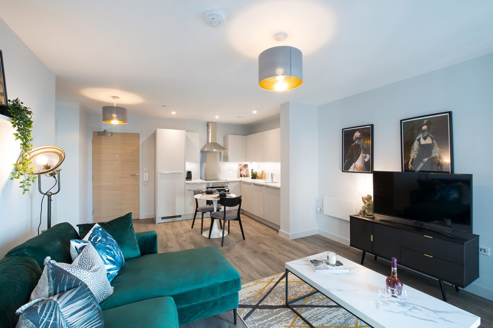
Then, as you go through into the apartments, the same design themes are developed and threaded into your personal space. Design-wise, your journey is connected right through to your own personal living space. This is really, really important.
From the inside out
HomeViews: Sheppard Robson is quite unusual in that you are architects, but you also have a very focused interiors team. Some of the best working relationships can be between architects and a separate designer, where that friction creates something brilliant, but it can also be difficult. Would you say being integrated and having the whole team working on Duet helped with its success?
HB:
I really think it did. I have to give credit to the teams based out of our Manchester office for Duet. They’re particularly good at enjoying the relationship between slightly different disciplines.
We ensure that our interior teams are integrated and supported in design development, so they’re not just choosing the finishes of the doors. They really are part of that initial concept. It starts in the planning, ensuring that subtlety is part of it, because residential is all about space.
For example, I’m sitting here looking at my kitchen. I need the flow and use case of my kitchen to be working effectively. It’s more of a challenge when it’s smaller because you need to make sure your process and ritual of making food is delightful. And that goes for every part of your living experience.
What was great about the team on the Duet project was the recognition of how that interior process affects planning. You work the exterior design of the building from that internal environment. Because if you can’t make that small interior space work effectively, then your occupier isn’t going to have a good experience.
Covid
HomeViews: Talking of space, the health crisis is making us all realise that there’s more flexibility in the way we work and live. How will this change the way you design living spaces in the future?
HB:
As well as being a very alarming and worrying situation, I think there are several things that are fascinating about the legacy of Covid-19.
The silver lining for current projects is that ‘people culture’ – our ability to work together and adjust – is being shown to be indomitable. The digital world was already evolving but there’s now been a turbocharge to our digital operations and the agility they allow.
Workers and organisations both now realise that the office isn’t just about sitting in rows of desks. It’s actually about coming together in more of a hospitality environment. Equally, home isn’t just about going to sleep in a dormitory. It’s about the services it offers, a closer connection to your community, and also working from there at times.
No going back
When the restrictions ease, we will be changed as people who live, work, play, learn. I don’t think you can undo that convergence.
Those developers who were interested in more of an experiential, neighbourhood-type environment will now be well ahead in terms of the product they can offer people. I think developments like Duet will be totally on the nail as far as having allowed that amenity space for this kind of convergence.
It’s quite exciting and the legacy could be tremendous. But equally, it needs to be mindfully managed.
Healthy buildings
HomeViews: Mental health and wellbeing were already hot topics for architects and designers but have been given even more emphasis now following lockdown. How do you see building and interior design responding to this?
HB:
I think what’s interesting about the wellbeing agenda is that, again, it has put people right at the heart of things. It’s reached all of our human existence.
Whether office, school or residential, there’s a need for texture, colour, light, functionality – a really nice place to be as a human being. The convergence of the space is people. Whether you’re providing an office for employees or a residential rental as a landlord, people just want the best quality.
And good design can contribute hugely to wellness. All the components that make up the score for a WELL building are natural design elements: great lighting, clear information, air quality, your access to daylight and the circadian effects of that.
Ultimately, you want to create wonderful, cool places that people want to spend time in and feel connected to emotionally.
Community creation
For the residential market we did a survey among our own teams in Manchester. It comes back to HomeViews reviews and ensuring you get your high scores and that people are feeding back on whether they like a space or not.
In the private rental market people were really keen on was feeling like they had an inbuilt neighbourhood in the city. Loneliness came out as one of the biggest issues for city living, so community was incredibly appealing to our teams.
We know through our experience with organisations like Get Living that people really value that sense of community. While the design is really important, it’s only part of the equation. The really important thing is for people to feel connected.
People matter
Good design is integral with a great service offering and an understanding of making people feel valued and connected. I think that’s a very exciting change in what we offer.
With the diversity of what’s happened in the last few years, what we now offer is a room with a view, amenities to die for. You’re creating neighbourhoods.
You’re going to attract people but you’re also going to make them feel well. You make a statement with your building and your brand that’s not just a strapline or a 2D document. You’re saying: “people matter because look where you can come and start your day with a coffee.”
HomeViews: You achieved BREEAM Outstanding and WELL Gold dual-certification for the Deloitte HQ fit-out back in 2018. How would you say your approach to sustainability has been affected by the health crisis?
HB:
I think sustainability is all wrapped up in one idea: awareness of your resource and better usage of it. The Deloitte project was all about thinking sensitively about how to use materials and follow through, and good usage was a fundamental part of how we achieved that.
For residential we now have an evolution in terms of lifestyle, but how much space do you need and what is that space? Making urban living really efficient in terms of usage is as important as making sure the materials and the energy you use are mindfully executed and employed.
I think of our Echo Street development. Personal space is slightly more economical there but you have wonderful amenities – you can rent a space for dinner for 20 people, you can go to the cinema or to a yoga class – all within the building. You don’t always need to own that space and hog that resource. That mindfulness is part of the sustainable approach.
Inspiration
HomeViews: Lastly, could you give us three buildings that really stand out for you? They could be projects you’ve worked on or just buildings you’ve been inspired by.
HB:
I have a huge softness and warmth towards the project we did on Wardour Street. The building itself was a factory for the Pathé Baby camera. Such a beautiful, cute object, but a real piece of innovation.
Pathé absolutely outstripped their opposition as this camera was able to take three times more film than competitors. We did the residential reuse for the building. Helping to repurpose it and thread some of that glorious heritage into the design was so fun.
Second, and completely left-field, there’s a wonderful couple who live near us in Richmond. They’ve got an acre of garden and the house has such a wonderful relationship between the beautiful environment internally and the outside space.
Sometimes when I look at that house I think, gosh! I am still an architect! Could I get that look and feel, the finishes, the eclectic mix and the beautiful living space inside and out? I’m not sure I could.
The Berresford House
The last one is very personal: the house I grew up in. My father was an architect [Ivor Berresford]. When he married my mother, he built a very Modernist house in Bromley.
The Blur music video for Coffee and TV was shot in that house – that shows it off quite well. With its massive glazed windows you really felt the seasons in that house.
When winter came the wonderful shapes of the trees and the reflections came into the house – you felt like you were in a tree house. When the summer came it felt like you were in a sea of green. It had a wonderful view and connection.
***
Hear from Duet’s building manager Dougie Orton-Wade on how he and his team maintain outstanding levels of service for Duet residents. Read resident reviews of Duet MediaCityUK by More. ‘Superenting’ and the Get Living developments Helen mentions.
Stay up to date with articles in this series on HomeViews Business, or explore our main blog for news and updates on HomeViews resident reviews.


